Health Clinic · Free
Aster
A clinic site that lowers the patient's pulse: airy sage-white calm, clear services, honest pricing, and booking without a phone call.
Fraunces + InterClinical calm, quiet competence
prompt.txt — paste as your first message
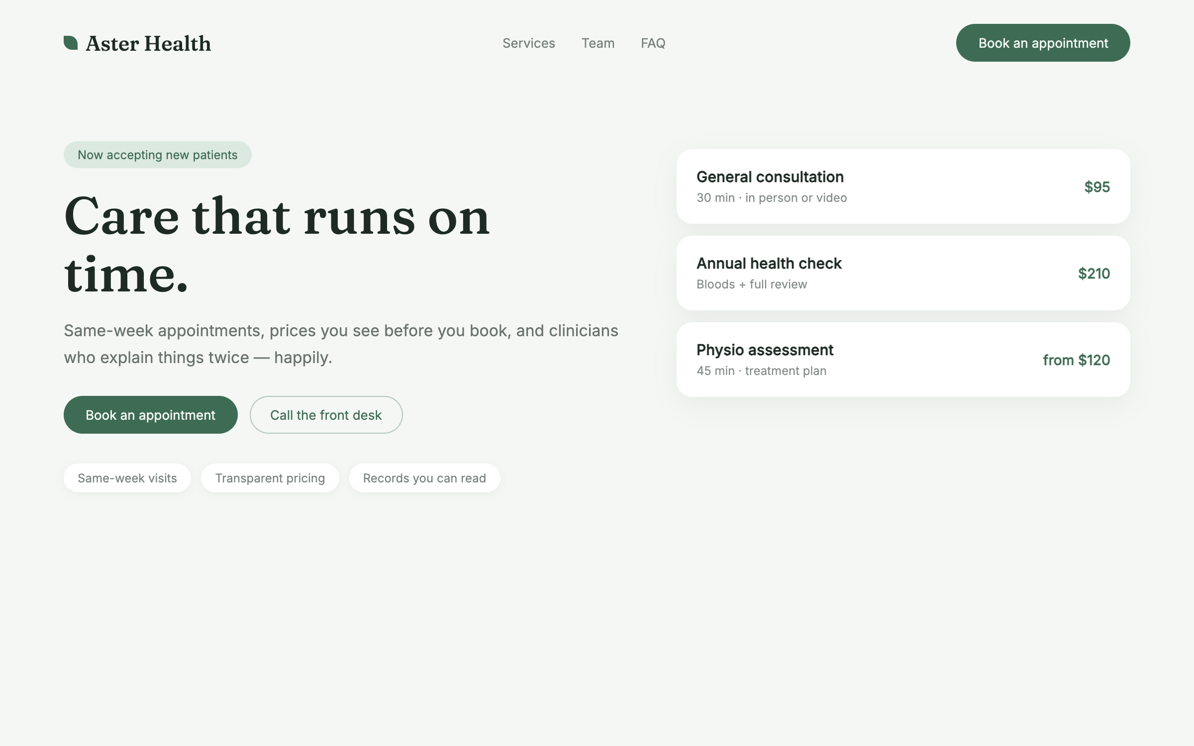
You are designing the site for a modern private clinic. Build a complete one-page site for a fictional practice called Aster Health ("Care that runs on time."). Write all copy — plain, warm, precise; no medical jargon, no fear language, no lorem ipsum.

ART DIRECTION — clinical calm. Background #F4F7F4, ink #1E2B24, deep sage #3E6B54 for accents and the primary CTA, soft mint #DCE9E0 for card fills. Generous whitespace; hairline rules; rounded 16px cards. Fonts via Google Fonts: "Fraunces" 500 for headlines (gentle serif — competence without coldness), "Inter" for body and UI. Small inline-SVG line icons (leaf, clock, shield) — never emoji. Mood: a waiting room with plants and no waiting.

LAYOUT, top to bottom:
1. Nav — wordmark with a small leaf mark, Services / Team / FAQ anchors, sage "Book an appointment" pill.
2. Hero — left-aligned: eyebrow ("Now accepting new patients"), serif headline, one reassuring sentence, "Book an appointment" CTA + a secondary "Call the front desk" ghost, then three tiny trust chips (Same-week visits · Transparent pricing · Records you can read).
3. Services — a grid of 6 cards: service name, one plain-English line, honest price or "from $X". No mystery pricing.
4. How a visit works — three numbered steps (Book online, Arrive — we run on time, Leave with a plan) each with two sentences.
5. The team — three clinician cards: CSS-gradient portrait circle, name and credentials, one human line ("Explains things twice, happily").
6. Quiet reassurance band — deep sage background, one cream serif sentence about respect for patients' time and intelligence.
7. FAQ — four real patient questions (insurance, first visit, results, cancellation) with straight answers, native details/summary.
8. Booking — labeled form (name, phone, reason select, preferred day) with the sage CTA; honest note it needs connecting; emergency-care disclaimer line pointing elsewhere.
9. Footer — hours, address, privacy line.

MOTION: minimal and steady. Fades up 10px with a 60ms stagger in the hero; sections reveal at 400ms opacity via IntersectionObserver; cards lift 2px on hover; nothing pulses, nothing bounces — calm IS the brand. Respect prefers-reduced-motion.

RULES: responsive at 375 / 768 / 1280. Semantic HTML, labeled form fields, visible focus states, body contrast at least 7:1. No real medical claims beyond scheduling and service descriptions; include a small "not for emergencies" note. All art is CSS and inline SVG. Complete without JavaScript.
Why these prompts work
Every template follows the same five-part structure, so the result is consistent every time:
01
Role + output contract
What to build and the quality bar — no lorem ipsum, real copy.
02
Art direction
Exact hex palette, Google-Fonts pairing, and mood keywords.
03
Layout spec
Section by section, top to bottom — nothing left to chance.
04
Motion spec
Entrances, scroll reveals, hovers, and timing curves.
05
Rules
Responsive breakpoints, accessibility, and what the AI must not do.
Works great for
Each industry page carries this style pre-tailored — your services, prices and palette already written in: