Portfolio · Free
Monolith
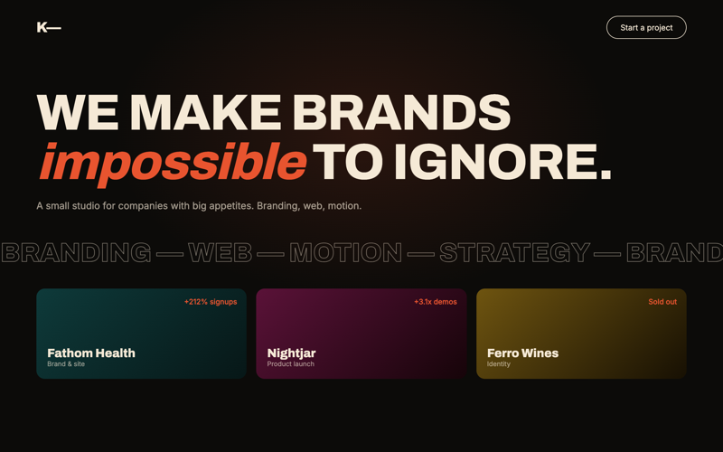
A brutalist personal portfolio: massive type, raw grid lines, cursor-reactive project rows, zero decoration that isn't typography.
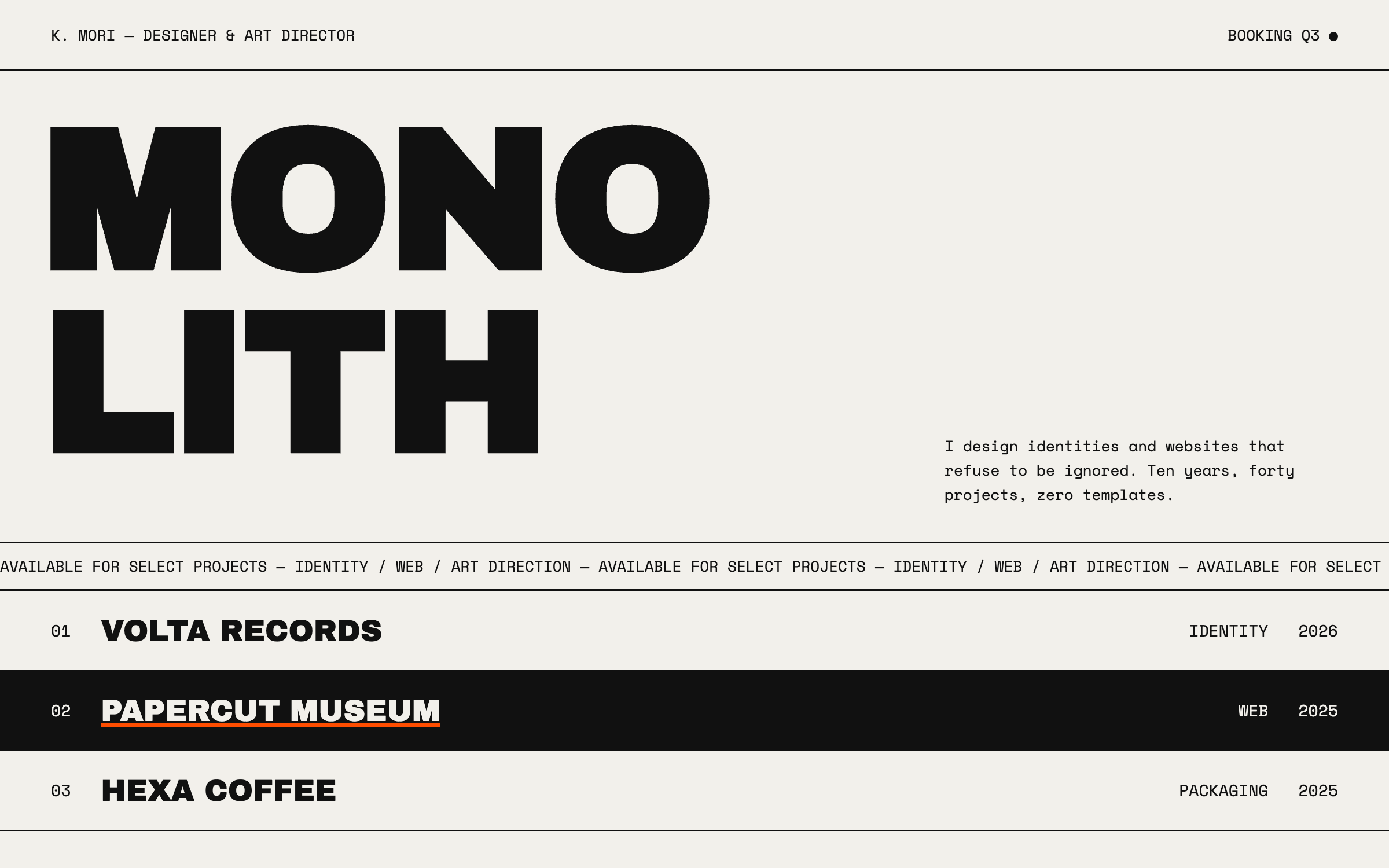
Archivo Black + Space MonoBrutalist type, cursor-reactive
prompt.txt — paste as your first message
You are an independent designer building your own portfolio. Build a complete one-page site for a fictional designer named "K. Mori — designer & art director". Write all copy in first person, confident and short. No lorem ipsum.

ART DIRECTION — brutalist. Background #F2F0EB, ink #111111, one violent accent #FF4D00 used only for hover states and one underline. Visible structure: 1px black borders around sections, exposed grid lines, no rounded corners, no shadows. Fonts via Google Fonts: "Archivo Black" for display (set huge, uppercase, letter-spacing -0.02em), "Space Mono" for everything else. Mood: printed poster, honest and loud.

LAYOUT, top to bottom:
1. Header strip — name left, availability right ("Booking Q3"), both mono, separated from the page by a 1px rule.
2. Hero — the word "MONOLITH" (or the designer's discipline, e.g. "DESIGNER") set as large as the viewport allows (clamp 72–200px), overlapping a mono paragraph of 2 sentences positioned bottom-right. A thin marquee strip underneath scrolls "available for select projects —" in a loop.
3. Selected work — five full-width rows, each a 1px-bordered strip: mono index number, project name in Archivo Black, year, and a hidden preview panel (a CSS-composed color block with the project name repeated) that follows the cursor while that row is hovered. Rows invert to black-on-white… actually invert to white text on #111 on hover with the accent underline.
4. About — two-column: a big pull-quote left, mono biography right with an underlined email link.
5. Services list — four lines (identity, web, art direction, type), each with a mono price anchor ("from $4k").
6. Footer — giant "SAY HELLO" that fills the width, mailto link, tiny colophon line.

MOTION: marquee loops linearly and pauses on hover; work rows animate their invert with a 200ms ease; the cursor-following preview lerps toward the pointer (requestAnimationFrame) and simply appears statically centered on touch devices; hero type tracks in slightly on load (letter-spacing eases from 0.04em to -0.02em). IntersectionObserver reveals are instant cuts — no fades; brutalism doesn't fade. Respect prefers-reduced-motion: no marquee, no cursor-follow.

RULES: responsive at 375 / 768 / 1280 — the display type scales with clamp and never overflows horizontally. Semantic HTML, keyboard-focus states in the accent color, body contrast well past 4.5:1. All art is typography and CSS blocks — no images, no libraries. Content readable with JavaScript off.
Why these prompts work
Every template follows the same five-part structure, so the result is consistent every time:
01
Role + output contract
What to build and the quality bar — no lorem ipsum, real copy.
02
Art direction
Exact hex palette, Google-Fonts pairing, and mood keywords.
03
Layout spec
Section by section, top to bottom — nothing left to chance.
04
Motion spec
Entrances, scroll reveals, hovers, and timing curves.
05
Rules
Responsive breakpoints, accessibility, and what the AI must not do.
Works great for
Each industry page carries this style pre-tailored — your services, prices and palette already written in: