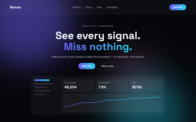
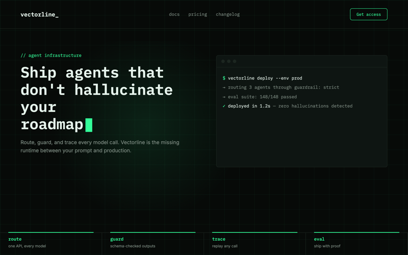
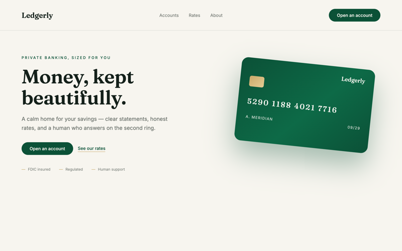
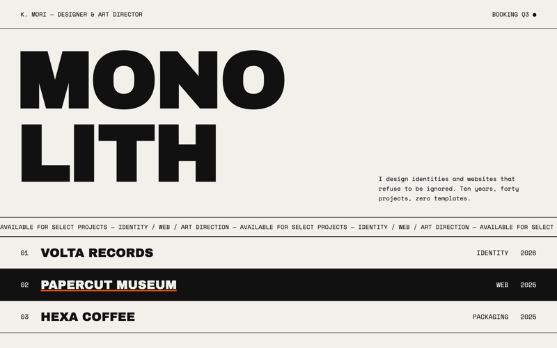
3D · Portfolio · Free
Strata
A portfolio built as layered strata: stacked paper planes at different scroll speeds, cut-out section edges, work cards that pull forward in 3D.
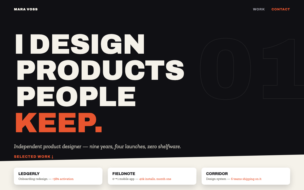
Archivo + Zilla SlabLayered paper depth, parallax strata
prompt.txt — paste as your first message
You are a designer building your own portfolio to win $20k projects. Build a complete one-page site with real, first-person copy for a fictional independent designer, Mara Voss ("I design products people keep."). No lorem ipsum, no fake modesty.

ART DIRECTION — layered strata. The page is a stack of paper planes: alternating full-width bands in ink #101014 and warm paper #F5F2EA, each band's top edge cut at a slight angle (clip-path polygon, alternating direction) so sections overlap like layered card stock; every band casts a soft shadow onto the one beneath. Accent: signal orange #E8552F, used for exactly one element per band. The depth move: within each band, foreground content scrolls at normal speed while a background layer (oversized outline typography, 8% opacity index numbers like "01") translates slower via a tiny scroll listener — true strata. Work cards are 3D: perspective 1000px on the grid; on hover a card rotates -3° X, lifts 10px, and its shadow stretches. Fonts via Google Fonts: "Archivo" 800 (tight, uppercase) for display, "Zilla Slab" for body — editorial contrast. Mood: printed matter with a z-axis.

LAYOUT, top to bottom (bands):
1. BAND ink — nav (name, two links) then the hero: giant stacked name (clamp 56–120px, each line offset 6px like misregistered print), one-line positioning statement, one orange link ("Selected work ↓").
2. BAND paper — Selected Work: four project cards in a 2×2 grid (title, one-line outcome with a real-sounding metric, three tag chips; artwork = bold CSS-composition thumbnails: color fields + oversized type + one SVG shape each — no images). The 3D pull-forward hover lives here.
3. BAND ink — Process: three numbered steps, the oversized "01 02 03" outline numerals drifting slower behind (the parallax signature).
4. BAND paper — About: two columns; a short bio that sounds like a person, and a facts list (city, years, tools, one strong opinion in orange).
5. BAND ink — Kind words: two testimonial cards in Zilla Slab italic with thin orange left rules.
6. BAND paper — Contact: one honest paragraph ("Two project slots open for autumn"), a large mailto link in Archivo, social links. Footer inside this band, small.

MOTION: hero lines slide in from alternating sides on load (staggered 90ms); the background strata layers translate at 0.4× scroll speed (transform only, requestAnimationFrame, no scroll-jank); cards do the 3D pull-forward on hover (280ms); each band reveals its content 20px-rise + fade via IntersectionObserver. Respect prefers-reduced-motion: no parallax, no 3D hover, instant reveals.

RULES: responsive at 375 / 768 / 1280 (grid stacks, giant name scales, angled edges shrink to 3°). Semantic HTML, focus-visible states, body contrast at least 7:1 on both band colors. All artwork is CSS and inline SVG. The page must read perfectly with JavaScript disabled — parallax is garnish, never structure.
Why these prompts work
Every template follows the same five-part structure, so the result is consistent every time:
01
Role + output contract
What to build and the quality bar — no lorem ipsum, real copy.
02
Art direction
Exact hex palette, Google-Fonts pairing, and mood keywords.
03
Layout spec
Section by section, top to bottom — nothing left to chance.
04
Motion spec
Entrances, scroll reveals, hovers, and timing curves.
05
Rules
Responsive breakpoints, accessibility, and what the AI must not do.