3D · Fintech · Free
Prism
A fintech page built from stacked glass panes: layered translucent cards at different depths, refracted gradient edges, a parallax card stack hero.
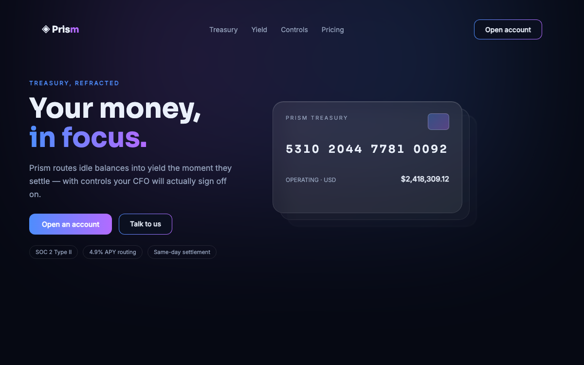
Sora + InterLayered glass panes with real depth
prompt.txt — paste as your first message
You are a senior brand engineer for a premium fintech. Build a complete one-page site with real, confident copy for a fictional treasury product called Prism ("Your money, in focus."). No lorem ipsum.

ART DIRECTION — depth through glass. Background #060913 with a slow-drifting conic gradient glow (#4F8DFD → #B36BFF, blurred, 15% opacity) anchored behind the hero. The signature move: STACKED PANES — key panels are three layered divs offset by 10–14px each, the back two progressively more transparent and more blurred, so every major element reads as a pane of glass floating above two ghosts of itself. Panes: rgba(255,255,255,0.05), 1px rgba(255,255,255,0.12) border, backdrop-blur(18px), and a 1px top edge highlight (inset 0 1px 0 rgba(255,255,255,0.18)) that sells the refraction. Text #EAF0FB, muted #93A0BA. Fonts via Google Fonts: "Sora" 600/700 headings, "Inter" body, tabular numerals for money. Mood: precise, expensive, optical.

LAYOUT, top to bottom:
1. Glass nav — wordmark, four links, "Open account" button with a gradient border.
2. Hero — split. Left: eyebrow, two-line headline (clamp 44–76px), one-sentence subhead, primary + ghost CTAs, a row of three tiny trust chips. Right: a stacked-pane bank card — a credit-card-shaped glass pane (number, name PRISM TREASURY, chip drawn as inline SVG) floating above two offset ghost panes; the stack tilts up to 6° following cursor position (transform perspective), and rests flat on touch devices.
3. Ticker band — a thin glass strip with six fictional FX pairs sliding in a 30s marquee loop.
4. Three feature panes — stacked-pane cards: instant settlement, yield routing, controls. Inline SVG line icons.
5. Deep panel — a wide pane containing a fake dashboard (balance, three accounts, an SVG area chart with a gradient fill that draws itself on reveal).
6. Numbers band — four stats with animated counters and glass dividers.
7. Security section — two columns of short reassurances, each with a small check pane.
8. Final CTA pane (the largest stack, three ghosts) and a compact footer.

MOTION: the hero stack assembles on load — back pane fades in first, then middle, then front, each rising 16px, 120ms apart. Cursor tilt on the bank card (max 6°, spring 300ms). Marquee loops linearly. Scroll reveals via IntersectionObserver: panes rise 24px + fade with their ghosts following 40ms behind — the stagger IS the depth effect. Chart path animates stroke-dashoffset once visible. Respect prefers-reduced-motion: no tilt, no marquee, static reveals.

RULES: responsive at 375 / 768 / 1280 (stacks flatten to single panes with a subtle border glow on mobile to save GPU). Semantic HTML, focus-visible rings, muted-text contrast at least 4.5:1. All art is CSS + inline SVG — no images, no libraries. Content complete without JavaScript; tilt and marquee are enhancements.
Why these prompts work
Every template follows the same five-part structure, so the result is consistent every time:
01
Role + output contract
What to build and the quality bar — no lorem ipsum, real copy.
02
Art direction
Exact hex palette, Google-Fonts pairing, and mood keywords.
03
Layout spec
Section by section, top to bottom — nothing left to chance.
04
Motion spec
Entrances, scroll reveals, hovers, and timing curves.
05
Rules
Responsive breakpoints, accessibility, and what the AI must not do.