Mobile App · Free
Pocketful
A mobile-app landing page with a floating CSS 3D phone whose screen changes as you scroll through the feature tour.
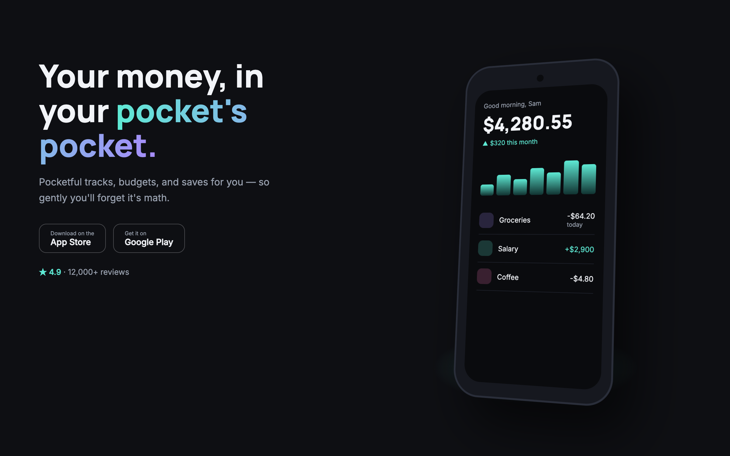
Manrope + InterFloating 3D phone, scroll-driven feature tour
prompt.txt — paste as your first message
You are designing the landing page for a beloved mobile app. Build a complete one-page site for a fictional personal-finance app called Pocketful ("Your money, in your pocket's pocket."). Real copy, friendly and concrete — no lorem ipsum.

ART DIRECTION — soft dark. Background #0E0F13, text #F2F4F8, muted #98A0AE, teal accent #5EEAD4 with violet support #A78BFA (used in a subtle dual-tone gradient for CTAs and highlights). The PHONE is pure CSS: a rounded 40px-radius device frame with a punch-hole camera, a screen area whose content is swapped between three CSS-built app screens (Home with balance + spark bars; Budgets with three progress rings; Save with a goal card and confetti tick). Perspective transform gives it a floating 3D feel (rotateY 18deg, rotateX 6deg at rest). Fonts via Google Fonts: "Manrope" 700/800 for headings, "Inter" for body. Mood: calm fintech, thumb-sized delight.

LAYOUT, top to bottom:
1. Nav — wordmark, two links, a small gradient "Get the app" pill.
2. Hero — split: left, headline + sub + two store badges built in CSS (Apple/Play shapes as inline SVG outlines with "Download on the…" text) + a 4.9★ rating line; right, the floating phone showing the Home screen, slowly bobbing, with a soft teal glow beneath.
3. FEATURE TOUR — the core section: three tall text blocks on the left (Track without trying, Budgets that bend, Saving that sticks — each with two sentences and a small stat). The phone STAYS STICKY on the right; as each text block scrolls into view, the phone's screen crossfades to the matching app screen and the device tilts a few degrees toward the active block. On mobile, the phone renders once above and the three screens appear inline as cards instead.
4. Trust band — four small tiles: bank-grade encryption, no ads, exports anytime, human support.
5. Testimonials — three short quote cards with gradient avatar dots and first names.
6. Final CTA — centered: big headline, the two store badges, and a QR-style decorative square (CSS grid of dots — clearly decorative).
7. Footer — links and a one-line privacy promise.

MOTION: phone bobs on a 5s loop; screen crossfades run 400ms with a slight parallax slide; the active tour block's stat counts up once; sticky tilt eases 300ms per transition; store badges lift on hover; rings on the Budgets screen animate to their values when that screen first shows. Respect prefers-reduced-motion: no bob, instant screen swaps.

RULES: responsive at 375 / 768 / 1280 with the tour degrading gracefully as described. Semantic HTML, focus states, body contrast at least 4.5:1. All art is CSS and inline SVG — no images, no libraries, no real store links (buttons link to "#" with an aria-label saying demo). Content fully readable with JavaScript off (all three screens shown statically in order).
Why these prompts work
Every template follows the same five-part structure, so the result is consistent every time:
01
Role + output contract
What to build and the quality bar — no lorem ipsum, real copy.
02
Art direction
Exact hex palette, Google-Fonts pairing, and mood keywords.
03
Layout spec
Section by section, top to bottom — nothing left to chance.
04
Motion spec
Entrances, scroll reveals, hovers, and timing curves.
05
Rules
Responsive breakpoints, accessibility, and what the AI must not do.