Community · Free
Gather
A community or church site that feels like being welcomed at the door: warm light gradients, plain-spoken times and directions, giving and groups without friction.
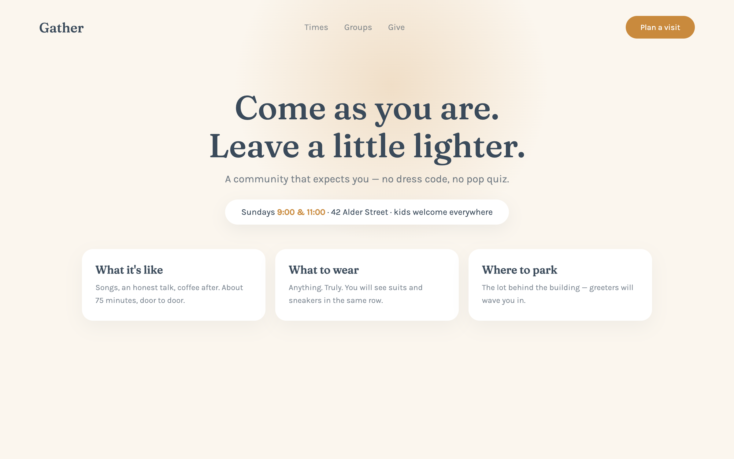
Fraunces + KarlaWarm light, open doors, Sunday-morning calm
prompt.txt — paste as your first message
You are designing the site for a community that wants newcomers to feel expected. Build a complete one-page site for a fictional congregation called Gather ("Come as you are. Leave a little lighter."). Write all copy — warm, plain, welcoming to someone who has never walked in; no insider language, no lorem ipsum.

ART DIRECTION — warm light. Soft paper #FBF6EE, gentle slate ink #3A4A5A, honey accent #C98A3D for CTAs and small marks. One large, soft light-through-windows gradient (honey → paper, very diffuse) behind the hero. Rounded 18px cards, generous air. Fonts via Google Fonts: "Fraunces" 500 for headlines, "Karla" for body. Simple inline-SVG marks (an open door, a cup, a small sun). Mood: morning light in a room that's glad you came.

LAYOUT, top to bottom:
1. Slim nav — wordmark, Times / Groups / Give anchors, a honey "Plan a visit" pill.
2. Hero — over the light gradient: serif headline, one sentence of welcome, "Plan a visit" CTA, and — impossible to miss — the practical line: "Sundays 9:00 & 11:00 · 42 Alder Street · kids welcome everywhere".
3. What to expect — three cards for first-timers (What it's like, What to wear — anything, Where to park) with two honest sentences each; this section is the whole ballgame for newcomers.
4. This week — a simple list of three upcoming gatherings with day, time, and a one-liner; no jargon names without explanation.
5. Groups — four rounded cards (by life stage and interest) each with a meeting cadence and a "just show up" note.
6. A quiet band — slate background, one cream serif sentence about belonging before believing.
7. Giving — a plain, pressure-free section: one sentence on what gifts support, a honey "Give" button, and a "no plate, no pressure" line; note the button needs connecting.
8. Visit planner — labeled form (name, email, which service, kids' ages — optional) with the CTA; honest note it needs connecting; "or just walk in — really".
9. Footer — address with a directions link, contact, service times repeated.

MOTION: soft and few. The light gradient brightens very slowly once on load; hero fades up gently; cards reveal at 450ms; the door mark's line draws once. Nothing attention-seeking. Respect prefers-reduced-motion.

RULES: responsive at 375 / 768 / 1280 — times and address readable without scrolling on mobile. Semantic HTML, labeled form fields, focus states, body contrast at least 7:1. Keep theology out of the copy beyond warmth — this is a door, not a doctrine page. All art is CSS gradients and inline SVG. Complete without JavaScript.
Why these prompts work
Every template follows the same five-part structure, so the result is consistent every time:
01
Role + output contract
What to build and the quality bar — no lorem ipsum, real copy.
02
Art direction
Exact hex palette, Google-Fonts pairing, and mood keywords.
03
Layout spec
Section by section, top to bottom — nothing left to chance.
04
Motion spec
Entrances, scroll reveals, hovers, and timing curves.
05
Rules
Responsive breakpoints, accessibility, and what the AI must not do.
Works great for
Each industry page carries this style pre-tailored — your services, prices and palette already written in: