Fitness Studio · Free
Forgeline
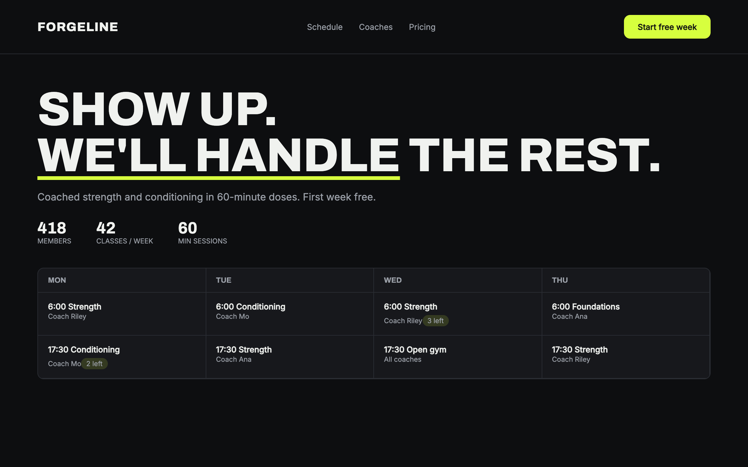
A gym site with a pulse: near-black iron, one voltage accent, condensed display type, and the weekly schedule treated as the hero it is.
Archivo + InterIron dark, loud type, schedule-first
prompt.txt — paste as your first message
You are designing the site for a training gym that takes itself seriously so members don't have to. Build a complete one-page site for a fictional gym called Forgeline ("Show up. We'll handle the rest."). Write all copy — direct, encouraging, zero bro-clichés ("beast mode" is banned), no lorem ipsum.

ART DIRECTION — iron dark. Background #0D0E10, off-white text #F0F2EF, voltage accent #D7FF3E used ONLY for the primary CTA, active states, and one underline. Panels #17181C with 1px #2A2D33 borders, sharp 10px corners. Fonts via Google Fonts: "Archivo" 800 (condensed feel, uppercase, tight tracking) for display, "Inter" for body and the schedule. Mood: chalk dust and good lighting.

LAYOUT, top to bottom:
1. Nav — wordmark, Schedule / Coaches / Pricing anchors, voltage "Start free week" button.
2. Hero — huge two-line display headline, one sentence, "Start free week" CTA + ghost "See the schedule", and a stat row (members, classes/week, avg session).
3. THE SCHEDULE — the centerpiece: a clean weekly grid (Mon–Sat columns on desktop) of class blocks — time, class name, coach, spots-left pill (a few "3 left" in accent). A real table semantically.
4. Training styles — three panels (Strength, Conditioning, Foundations) each with a hard-edged inline-SVG icon, two lines, and "first class free".
5. Coaches — three cards: gradient portrait block, name, one-line coaching philosophy with actual personality.
6. Pricing — three plans (Drop-in, Monthly, Committed) with honest inclusions; middle plan gets the accent border; no asterisks games.
7. Proof band — one big member quote in display type, name and tenure.
8. Sign-up — labeled form (name, email, goal select) with the voltage CTA; note it needs connecting.
9. Footer — hours, address, a "no contracts" line.

MOTION: punchy but disciplined. Hero lines slide up 24px fast (250ms, 60ms stagger); schedule blocks reveal as columns left-to-right; stat numbers count up once; panels lift 4px on hover with the accent border flashing on; the CTA has a 1px accent pulse on first reveal only. Respect prefers-reduced-motion: instant everything.

RULES: responsive at 375 / 768 / 1280 — the schedule collapses to a stacked day list on mobile (still a semantic table), never a horizontal page scroll. Labeled form fields, focus states, body contrast at least 4.5:1 (the voltage green is never body text). All art is CSS and inline SVG. Complete without JavaScript.
Why these prompts work
Every template follows the same five-part structure, so the result is consistent every time:
01
Role + output contract
What to build and the quality bar — no lorem ipsum, real copy.
02
Art direction
Exact hex palette, Google-Fonts pairing, and mood keywords.
03
Layout spec
Section by section, top to bottom — nothing left to chance.
04
Motion spec
Entrances, scroll reveals, hovers, and timing curves.
05
Rules
Responsive breakpoints, accessibility, and what the AI must not do.
Works great for
Each industry page carries this style pre-tailored — your services, prices and palette already written in: