Restaurant · Free
Ember
A restaurant site built around appetite: charcoal room, ember-orange heat, a menu typeset like the real thing, and a reservation flow that doesn't fight you.
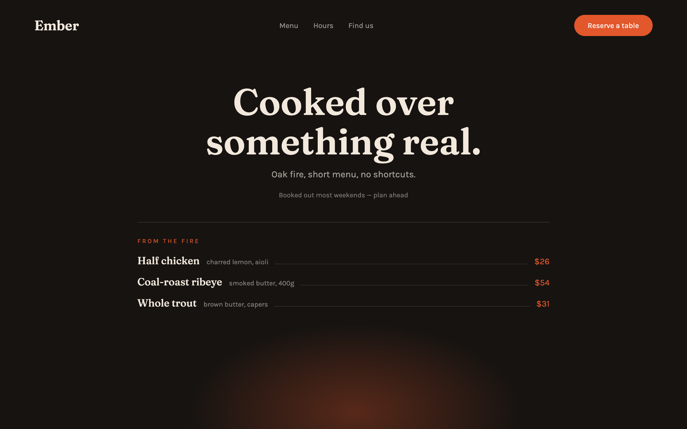
Fraunces + KarlaCharcoal + flame, menu-first appetite
prompt.txt — paste as your first message
You are designing the site for a restaurant with a waitlist. Build a complete one-page site for a fictional wood-fired place called Ember ("Cooked over something real."). Write all the copy — confident, sensory, no "culinary journey" clichés, no lorem ipsum.

ART DIRECTION — charcoal and flame. Background #161311, warm cream text #F2E8DC, ember accent #E2572B, deep amber #B8742E for secondary warmth. A faint radial glow (like coals) low in the hero. Fonts via Google Fonts: "Fraunces" 500/600 for headlines and dish names, "Karla" for body and details. Thin rules in rgba(242,232,220,.14) structure the menu. Mood: the table nearest the kitchen.

LAYOUT, top to bottom:
1. Nav — serif wordmark, Menu / Hours anchors, an ember "Reserve a table" pill.
2. Hero — centered: one big serif line ("Cooked over something real."), one sentence about the fire, "Reserve a table" CTA, and a small proof line ("Booked out most weekends — plan ahead").
3. The menu — the heart of the page: two columns typeset like a real menu (dish name in serif, one-line description in Karla, price right-aligned with a dotted leader). Three groups: From the fire / Smaller / Sweet. 9–12 dishes with honest prices.
4. The room — a horizontal strip of three CSS-gradient scene tiles (fire glow, table setting tones, night exterior) with one-word labels.
5. Hours & finding us — two clean columns: service times, address line, "walk-ins at the bar".
6. Reservation — a labeled form (name, party size, date, time select) with the ember CTA; honest note it needs connecting; alternative phone line shown.
7. Footer — one-line story, socials, quiet copyright.

MOTION: warm and unhurried. The coal glow breathes on an 8s loop; hero text fades up with a 70ms stagger; menu groups reveal as blocks (not per-line — respect the reader); dotted leaders draw once on reveal; the reserve pill brightens on hover like stoked embers. Respect prefers-reduced-motion: static glow, plain fades.

RULES: responsive at 375 / 768 / 1280 (menu single-column on mobile, prices stay aligned). Semantic HTML — the menu uses definition-list or table semantics, not divs pretending. Labeled form fields, focus states, body contrast at least 4.5:1. All art is CSS gradients — no photos, no libraries. Complete without JavaScript.
Why these prompts work
Every template follows the same five-part structure, so the result is consistent every time:
01
Role + output contract
What to build and the quality bar — no lorem ipsum, real copy.
02
Art direction
Exact hex palette, Google-Fonts pairing, and mood keywords.
03
Layout spec
Section by section, top to bottom — nothing left to chance.
04
Motion spec
Entrances, scroll reveals, hovers, and timing curves.
05
Rules
Responsive breakpoints, accessibility, and what the AI must not do.
Works great for
Each industry page carries this style pre-tailored — your services, prices and palette already written in: