3D · SaaS · Free
Clayfield
A claymorphic SaaS page: puffy soft-3D cards that look molded from putty, double inner shadows, candy palette, squishy hover physics.
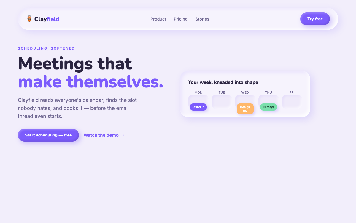
Nunito + InterClaymorphism — soft 3D putty UI
prompt.txt — paste as your first message
You are a senior product designer shipping a launch-ready SaaS page in full claymorphism. Build a complete one-page site with real, confident copy for a fictional scheduling product called Clayfield ("Meetings that make themselves."). No lorem ipsum.

ART DIRECTION — soft 3D clay. Background #F2EEFB. Every card and button looks molded from putty: large border-radius (24–32px), TWO box-shadows on each element — a dark outer (e.g. 8px 8px 24px rgba(124,92,252,0.18)) AND a light inner top-left (inset -6px -6px 12px rgba(255,255,255,0.9), inset 6px 6px 12px rgba(124,92,252,0.12)) — so surfaces read as puffy, not flat. Palette: lavender base, primary #7C5CFC, warm accent #FFB86B, mint #7BE0AD for success moments. Ink #2A2440, muted #6E6690. Fonts via Google Fonts: "Nunito" 700/800 for headings (round terminals suit clay), "Inter" for body. Mood: friendly, tactile, expensive toy.

LAYOUT, top to bottom:
1. Clay nav pill floating on scroll — wordmark, three links, a puffy "Try free" button.
2. Hero — left: eyebrow, big rounded headline (clamp 42–72px), subhead, primary clay button + ghost link. Right: a clay calendar widget built in pure HTML/CSS — a week grid with three puffy event chips, one gently bouncing.
3. Logo strip — five fictional customers embossed INTO the background (light inner shadow text effect).
4. Three feature cards — each a clay slab with an inline-SVG icon sitting on its own tiny clay disc, title + two lines.
5. Product band — a large clay panel containing a fake UI (sidebar + agenda list) where each row is its own soft chip.
6. Metrics — four clay pills with big animated counters.
7. Pricing — three tiers as clay slabs; the middle one is physically LARGER and floats 12px higher with a stronger shadow.
8. FAQ (native details/summary styled as clay chips) and a rounded footer.

MOTION: everything is squishy. Buttons scale to 0.96 with a slightly flattened shadow on :active (the "press into putty" effect). Cards lift 6px and deepen their outer shadow on hover, 260ms cubic-bezier(0.34,1.56,0.64,1) — a touch of overshoot. Hero widget's event chip does a slow 4s float loop. Sections reveal on scroll via IntersectionObserver: rise 20px + fade, 60ms stagger. Counters count up when visible. Respect prefers-reduced-motion: no float, no overshoot, instant reveals.

RULES: fully responsive at 375 / 768 / 1280 (hero stacks, calendar widget shrinks gracefully). Semantic HTML, visible focus rings (2px #7C5CFC offset 3px), body contrast at least 4.5:1 (clay is soft; text must not be). All artwork is CSS shadows/gradients or inline SVG — no images, no libraries. Content complete without JavaScript.
Why these prompts work
Every template follows the same five-part structure, so the result is consistent every time:
01
Role + output contract
What to build and the quality bar — no lorem ipsum, real copy.
02
Art direction
Exact hex palette, Google-Fonts pairing, and mood keywords.
03
Layout spec
Section by section, top to bottom — nothing left to chance.
04
Motion spec
Entrances, scroll reveals, hovers, and timing curves.
05
Rules
Responsive breakpoints, accessibility, and what the AI must not do.